Tale of a Logo

Back in 2007 when we started QuadCast, we had nothing, no logo, no format, no nothing. And much like everything with the show, we got an idea around the start and kind of evolved it into the beast we are today. That’s one of the reasons I really like the logo we have, because it reflects the growth of the show. The original logo was simply skewed white text in the font Serpentine, which is the QuadPod logo font, on a blue background with silhouettes of the QuadPod crew, created for a college project, re-purposed to show who would be in the show.

This logo served it’s purpose for the first few years of the show, but at some point, I believe in 2009, the 3D block fonted QuadCast and anti-star logo was born. This logo was made on my old Windows XP box, and was lost when that PC died and I moved to my Vista (upgraded to 7 shortly thereafter) box. All that exists of that version of the logo is the 300×300 pixel Jpg. But, we still ended up using that logo for a long while, up until around 2010. Continue reading

Green Lantern: Rage of the Red Lanterns

Green Lantern: Rage of the Red Lanterns coverWith all the hype around the DC Comics Blackest Night event in full swing, I finally decided to crack open a Green Lantern book and see what all the fuss was about. I mean, I’ve heard nothing but Jesus-like praise for writer Geoff Johns, so how can you not at least be intrigued a little and take a peak under the covers? I started with Secret Origin, Rebirth, then followed it up with both halves of the Sinestro Corps War. After my homework on the character, and the mythos were completed (I previously only knew John Stewart from the Justice League Animated Series, so, Hal was new to me), I cracked open the first book leading into the Blackest Night event. That of course being “Rage of the Red Lanterns”.

Am I the only one who wants to spell “Lanterns” with a U instead of an E? Continue reading

All-Star Superman Volume 1

All Star Superman Volume 1The first of what I hope to be many reviews in the coming while, and my first Comic review.

This is the first volume of the new imaging of Superman through the mind of Grant Morrison, and the eyes of Frank Quitley. Now, I think it important to point out that I am, by no definition, a Superman fan. I typically find him interesting as a side character, or as the partner with Batman for the ensuing conflicts. So outside of the Emperor Joker trade, I have not read a stand-alone Kal El book. Here goes nothing… Continue reading

A Dark Knight, for DVDs

Really? You did what?

Really? You did what?

Still riding high on the Dark Knight movie bandwagon from July, I was more than just excited to get my hands on the DVD that would assuredly be liquid greatness. But now that I’ve gotten the discs, and have had time to peruse them, I’m left with a feeling of awe.

and not, my friend, in a good way. Continue reading

The Road Less Traveled.

I just finished doing a set of proofs for a client. The proofs are for the proposed covers to portfolios they will be getting that will contain information packages for their clients.

The first proof was a barebones logo, picture of a car (it’s fora  dealership) and their contact info underneath, with a darkish blue background. Looks very cut and paste. The reason being, in the convoluted message we were given, that’s what they asked for, although they also wanted it to somehow look like their business card, which is a beauty shot of the same car, with a glass floor, and lots of blues, black, and silvers highlighted everywhere.

The second proof was a recreation of the image on their card. All the gradiations, cool lighting, and the car has a very cool colour effect applied to it to reflect the blue setting, much like their card (which was low rez, hence the recreation).

Now, and I do this with all my proofs, I decided to layout the information differently on the two proofs, all info in list form at the bottom on the plain-jane, and splitting it up on the good one, with the URL at the top, and the other info hugging the two bottom corners. Suits the design more, and is a better use of the space (and also doesn’t look like a grade school report cover, but that’s, again, my directive). I always give what’s asked for, and then another version that actually looks good.

Would you believe they picked the ugly one?

Some information censored

That’s one final project that won’t make it to MY porfolio. I’ll take the good one.

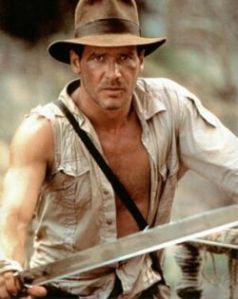
Indiana Jones: and the Kingdom of the Confused Review

Indiana Jones 4The second major blockbuster of the 2008 Summer Movie Season has hit in the form of the 65 year old Harrison Ford reprising his famous roll as Indiana Jones in the fourth instalment of the series: The Kingdom of the Crystal Skull.

Truth be told, I only actually watched the original trilogy of Indy flicks a few months ago, which kept the stories fresh in my mind leading into the latest episode.

Just a heads up, spoilers are afoot, so the story-squeamish should avert their sweaty-virgin-eyes. Continue reading

Custodial Designing

One of the things that has always gotten to me is bad design.

It doesn’t take much, but a carelessly made design can cost someone else, like me, hours of their life they’ll never get back, to fix their mistakes.

Well, one of these careless creations just graced my presence. I’ve been working on this bronze plaque for the Legislative Assembely of Ontario. Aside from the 20 revisions, a rant for another day, I had to hound them, start to finish, to get us their crest for the design, or I would have to design it, and it would most likely be a good four hours of design time they’d be paying for.

Well, they finally get it to me, after I rejected 3 horrible quality versions. Looks good, I send it along, the job looks to be out of our hands, and in the process of being made into a 40 pound slab of metal with my design displayed boldly on it’s face.

Not the case.

I got a message back that the lineart is in no way usable on their end. So I look at the file. In it’s filed state in Illustrator, it looks good. High quality, some easily visible short cuts by the designer noted, but, not my problem, it’s the supplied art. Well.. once you turn it into lines, and see what exactly you have to work with, and what they actually need in order to do the cut, its a horror show. Its a work file, not a finished design. So, for example, certain shapes in the crest are white circles with black borders that overlap the white to make the white smaller, and the white is supposed to be the background in the first place. Or, a black crown, that’s the basic shape, with 24 small circles following the curve of it to give it the appearance of stones on the crown, but just left floating on the crown, not actually merged into it.

So, for us to actually make this sign, I had to take their design, and spend another two hours retooling it, merging things down, cursing the life of the original designer, finding workarounds to make it into one solid piece, and finally it worked.

But what gets to me is that I shouldn’t have to do these workarounds. To me, if you are sending a file out, you make sure that file is in a finished form that can actually be used, not a work file that ends up causing more pain and suffering.

Common courtesy designs are my practice, make it your’s too.